2017 Colors of the Year
Feeling uninspired in your home and dreaming of redesigning your home’s décor in 2017? Or maybe you want to stay current with the latest trends? Here are the 2017 Colors of the Year as chosen by Pantone, Benjamin Moore and Sherwin-Williams to give you some inspiration
Pantone’s 2017 Color of the Year: Greenery
 This refreshing and revitalizing shade is a fresh and zesty yellow-green shade that evokes early spring. This nature’s neutral is great for bringing the outdoors into the home. According to Pantone, the “more submerged people are in modern life, the greater their innate craving to immerse themselves in the physical beauty and inherent unity of the natural world.”
“Greenery bursts forth in 2017 to provide us with the reassurance we yearn for amid a tumultuous social and political environment,” Leatrice Eiseman, executive director of the Pantone Color Institute, said. “Satifisying our growing desire to rejuvenate and revitalize, Greenery symbolizes the reconnection we seek with nature, one another and a larger purpose.”
Greenery is a versatile “trans-seasonal” shade that lends itself to many color combinations. It can be paired with neutrals, brights, deeper shades, pastels and metallic. If you’re looking to sell your home this year, mix in greenery through accents in art pieces and home décor versus painting rooms.
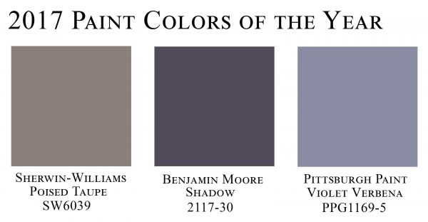
Benjamin Moore’s 2017 Color of the Year: Shadow
 Last year Benjamin Moore picked Simply White, and in a bold move that reflects other design trends for 2017, they chose the bold hue of Shadow, a rich royal amethyst.
“After a year of looking at white, we were looking for something with more feeling,” a Benjamin Moore spokesman said.
This dramatic and rich hue sets a sophisticated tone to your home and also pairs well with the palette of 22 colors the company recommended pairing it with including ruby and emerald.
“Allusive and enigmatic, Shadow is a master of ambiance, Ellen O’Neill, Benjamin Moore creative director, said. “It is a color that calls to mind a past, yet it can also make a contemporary, color-confident statement. Shadow is sophisticated, provocative and poetic; it can bring energy to a space or harmony and a moment of respite.”
Sherwin-Williams’ 2017 Colors of the Year: Poised Taupe
 After seeing the rich and bright tones from Pantone and Benjamin Moore, Sherwin-Williams selected a rich neutral tone. Poised Taupe also creates a cozy lifestyle. It also brings a sense of sanctuary into the home so you feel restored and in balance as soon as you walk through the door.
Sherwin-William’s pick is an earthen brown combined with conservative gray. The color also exudes a weathered, woodsy and complex neutral. According to Sherwin-Williams, “it celebrates the imperfections and authenticity of a well-lived life.”
Poised Taupe also pairs well with cornflower hues; organics like vegetal green, citrus green, weathered bronze and mustard yellow. Vintage pastels; wine colors and purple; reds and corals; and pops of yellow pair well too.
–
The Minteer Team has a passion for delivering top quality service and helping clients find their dream home. Give us a call! Our highly qualified agents are waiting to help!