Fall 2016 Color Trends for Your Home
Fall 2016 Color Trends for Your Home
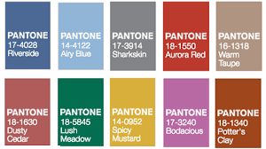
Looking for some new colors to make your home pop this fall 2016 season? We’ve got you covered! PANTONE, the color trendsetters themselves, have released their fall color report. The palette is led by colors from the blue family. The fall palette also has earth tones to keep the palette grounded and pops of vibrant jewel tones.
“Blue skies represent constancy as they are always above us,” Leatrice Eiseman, executive director of the PANTONE Color Institute, said. “Grays give us a feeling of stability, red tones invite confidence and warmth, while the hot pinkish purples and spicy mustard yellows suggest a touch of the exotic.”
Here are the 10 colors from the PANTONE Fashion Color Report with details from Eiseman.
 1. Riverside: PANTONE 17-4028
This brand new color earmarks the importance of blue in the palette and takes precedence this fall. This is a cool and calming color while also being strong and stable. Riverside displays a subtle vibrancy and sophistication. This is a great color to add as it borders on exciting yet maintains a sense of constancy.
 2. Airy Blue: PANTONE 14-4122
Another new color, Airy Blue’s lofty nature will help you to feel lightness and freedom. If you’re looking for colors that will help your space feel almost weightless in a tight or dark space, Airy Blue is your color. With nods to Color of the Year, Serenity, Airy Blue pairs well with Lush Meadow, Taupe or Dusty Cedar.
 3. Sharkskin: PANTONE 17-3914
Gray has been on trend in home design for a while, but this new gray has a slight edge to it, while remaining in the neutral palette. Sharkshin pairs well with any fall color whether it’s bright or muted. This is literally a color that the entire fall palette can rest on. Add Sharkskin if you’re wanting to add gray to your home but with a contemporary look.
 4. Aurora Red: PANTONE 17-1550
This warm, sensual color is a welcome punch to the fall palette. This is a color to add to an unmistakable confidence to a room. Aurora Red is exciting and dynamic and gets the metaphorical blood of any room pumping while also being immediately pleasing to the eye.

5. Warm Taupe: PANTONE 16-1318
If you’re looking for a rich neutral that is pleasing and easy to work with, then warm taupe is your color. This organic color suggest reassurance and stability and works well with any of the Fall 2016 color palette. It’s also timeless, meaning your home won’t look dated five years from now.
 6. Dusty Cedar: PANTONE 18-1630
If you like pink, then Dusty Cedar is the fall and winter pink for you. This warm and welcoming color is a dustier rose-toned Pink shade with some complexity. Dusty Cedar also gives a nod to the PANTONE Color of the Year for 2016, Rose Quartz.

7. Lush Meadow: PANTONE 18-5845
This new color evokes fresh botanicals and foliage. Lush meadow will elevate the overall elegance of a room with it’s rich, elegant, vibrant and sophisticated hues. This shade displays a brightness, panache and depth of color that will elevate it from the earthier, natural greens.
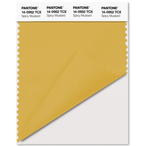 8. Spicy Mustard: PANTONE 14-0952
This exotic addition bounces elegantly off other colors in the fall palette. This unexpected and unusual color is a spicier and zestier Yellow than in previous seasons. Spicy Mustard adds another splash of uplifting vibrancy that will shine in abstract and geometric accents.
 9. Potter’s Clay: PANTONE 18-1340
Potter’s Clay has elements of russet Orange in the undertones, but gives a grounded feeling that’s anything but boring. This neutral earth tone is what you come to expect in a fall color palette and will add sophistication to a room. Potter’s Clay is great for layering, giving a strong foundation to a room.
 10. Bodacious: PANTONE 17-3240
Bodacious, a new color, is an unexpected fall color but will lend itself to vibrant color combinations. This versatile color, while a bright and rich Purple, has hints of a more sophisticated Pink and blends well with Pinks and Reds. Bodacious will turn home accents into major statements.