Star Power
This article was written by Kathryn O’Shea-Evans and was featured in our June issue of Home By Design magazine. Photography by Meghan Beierle-O’Brien. To visit the original Home By Design article, click here.
INTRODUCING STORIED CHARM TO THIS SOUTHERN CALIFORNIA COTTAGE
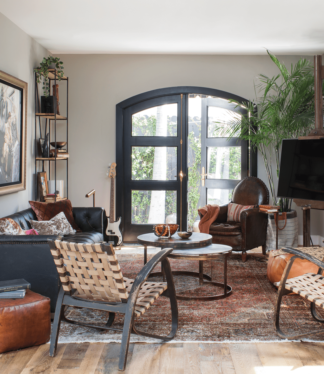
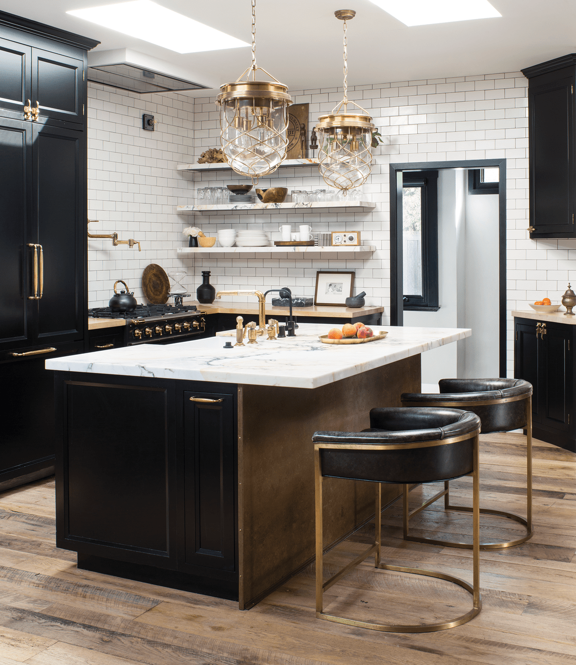
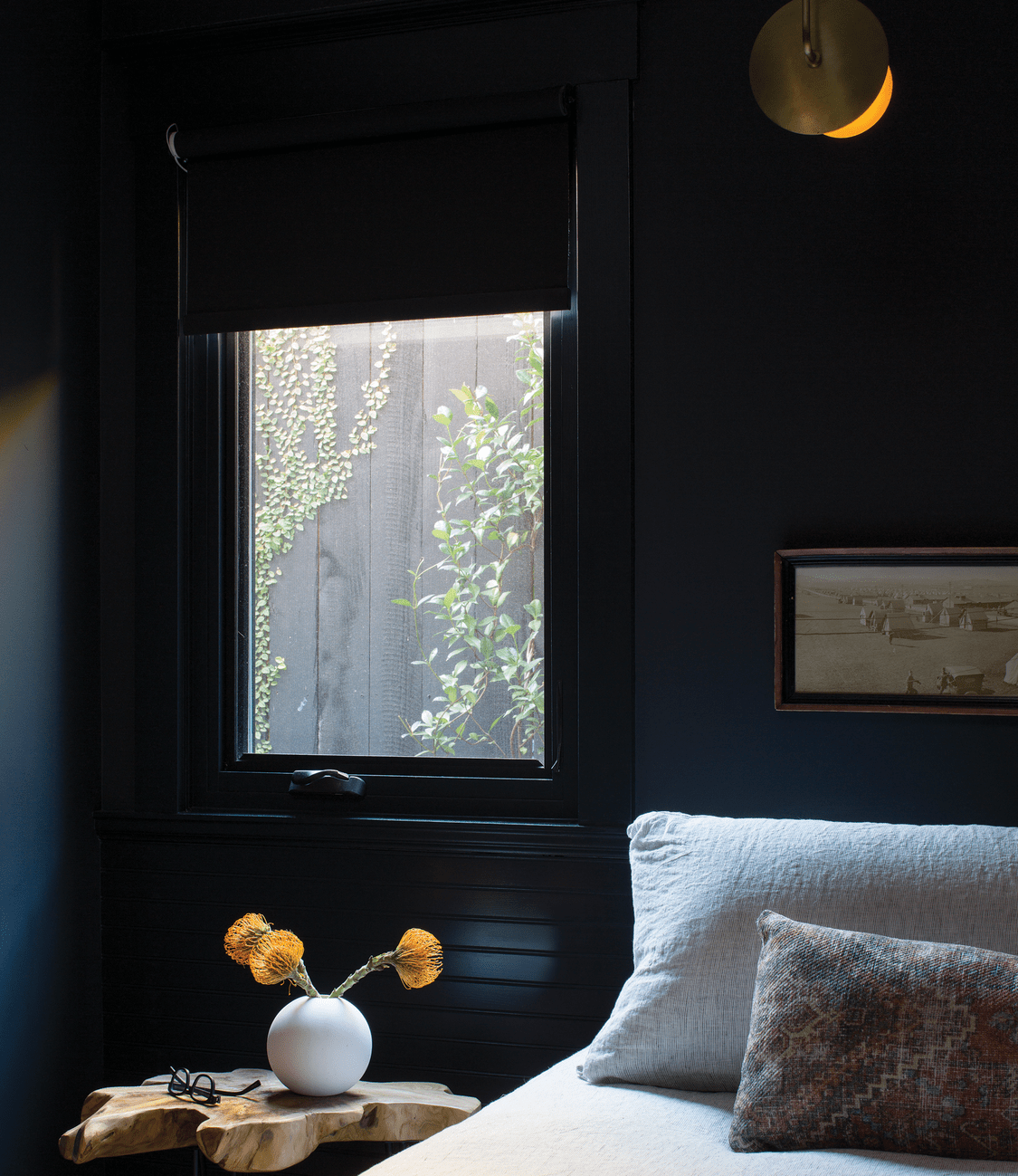
In Hollywood, California, it takes a lot to “wow.” A bit of star power and pixie dust is all but required. So when designer Breeze Giannasio’s client enlisted her to add personality to his Los Angeles bungalow, she was ready with some good old-fashioned movie magic. “The bones [of the house] were great, but we just added layers and brought his own personality to the space,” she recalls. “It’s so funny because I’m a wallpaper queen when left to my own devices, but the wallpaper in the dining room was actually there already! It seemed quite feminine, but by bringing in black and the handsome, more rugged industrial and rustic elements and subdued color palette, I think we found ways to have a feminine-masculine tension.”
Just as in any Old Hollywood film, that color palette Giannasio mentioned—with caramel browns, blacks, and warm woods—helped set the tone. “It’s a favorite palette of mine, with very warm neutrals that allow the metals to shine like jewelry.” And while it may not look like it, the home has an open plan. “It makes me think of an old New York brownstone done in a mini set version,” she says. “If they had to do a Friends reboot, this would be a great house to do it in because you can breeze through each set, if you will. The way it’s photographed, it presents as if they’re all different rooms, but they’re actually connected.”
Creating a different sense of scene throughout was part of the design challenge for Giannasio. “Trying to infuse each of these discrete spaces with their own personality and sense of place was one of the objectives,” says Giannasio. One key to achieving that came in the form of a storied touch. “It was very important that we added things that had a patina and an age to them.”
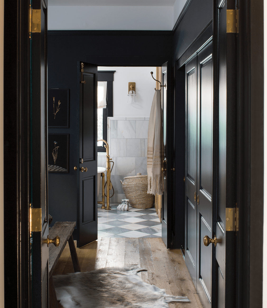

Case in point: the vintage doors over the storage shelves in the marble-tiled primary bathroom, which she hung with barn-door hardware so they could slide back and forth with ease. “When you want to see the storage, you can, and when you want it to be closed, you can just have the nice backdrop of the doors.” But it’s the worn effect of their surface that really transforms the room. “I get the sense that they are hundreds of years old and have had many lives,” says Giannasio. “The worn gray paint used to be a pristine sort of French blue gray.”
Throughout, those antique touches supply an aura of history. “There’s artwork from his grandparents and some of his mother’s black-and-white photography. I think the industrial table is made from salvaged wood. The leather sling chairs in the open office area are also vintage, as well as the bentwood leather chairs in the living room area.”
Adding maximum impact to the palette is the inky black paint used on the trim and primary bedroom walls (the latter of which is Farrow & Ball’s Railings that makes it feel wonderfully cave-like . . . a sleepy Southern California retreat). “I very rarely use a pitch black,” the designer notes of the bedroom hue. “There’s always a bit of hue or pigment in it that brings a nice warmth. So, in the bedroom there [are] blue inky undertones that just envelop you and make it seem very rich. Anything that’s brown really pops, so if you tend to have vintage wood pieces with a nice luster, they will just shine at their most optimal against the backdrop.” Call it black to the future—or the past.