Villa With Verve
This article was written by Victoria Hittner and was featured in our May issue of Home By Design magazine. Photography by Mariell Lind Hansen. To visit the original Home By Design article, click here.
MOODY HUES AND QUIRKY FINDS ENLIVEN THIS VICTORIAN HOME
As the creative duo behind London-based design house Run for the Hills, Anna Burles and her husband, Christopher Trotman, lead individual teams that bring a fascinating blend of graphics, branding, and design to both commercial and residential design projects. And this Victorian villa, located in the Clapton district of London, provided an ideal canvas for their talents.
“We’re certainly not bland,” notes Burles. “We’re quite eclectic and we love vintage and mixing new and old. And I think we often attract a creative type [of client]. It was great working with [these clients] and I think you can tell, can’t you, that they were quite creative? The choices wouldn’t be to everybody’s taste, or they might love them but be a bit scared of doing them in their own home. And we didn’t have those problems here. The fringing, the clashing patterns, the dark, bold colors—kind of the punchier the better, which was lovely for us.”
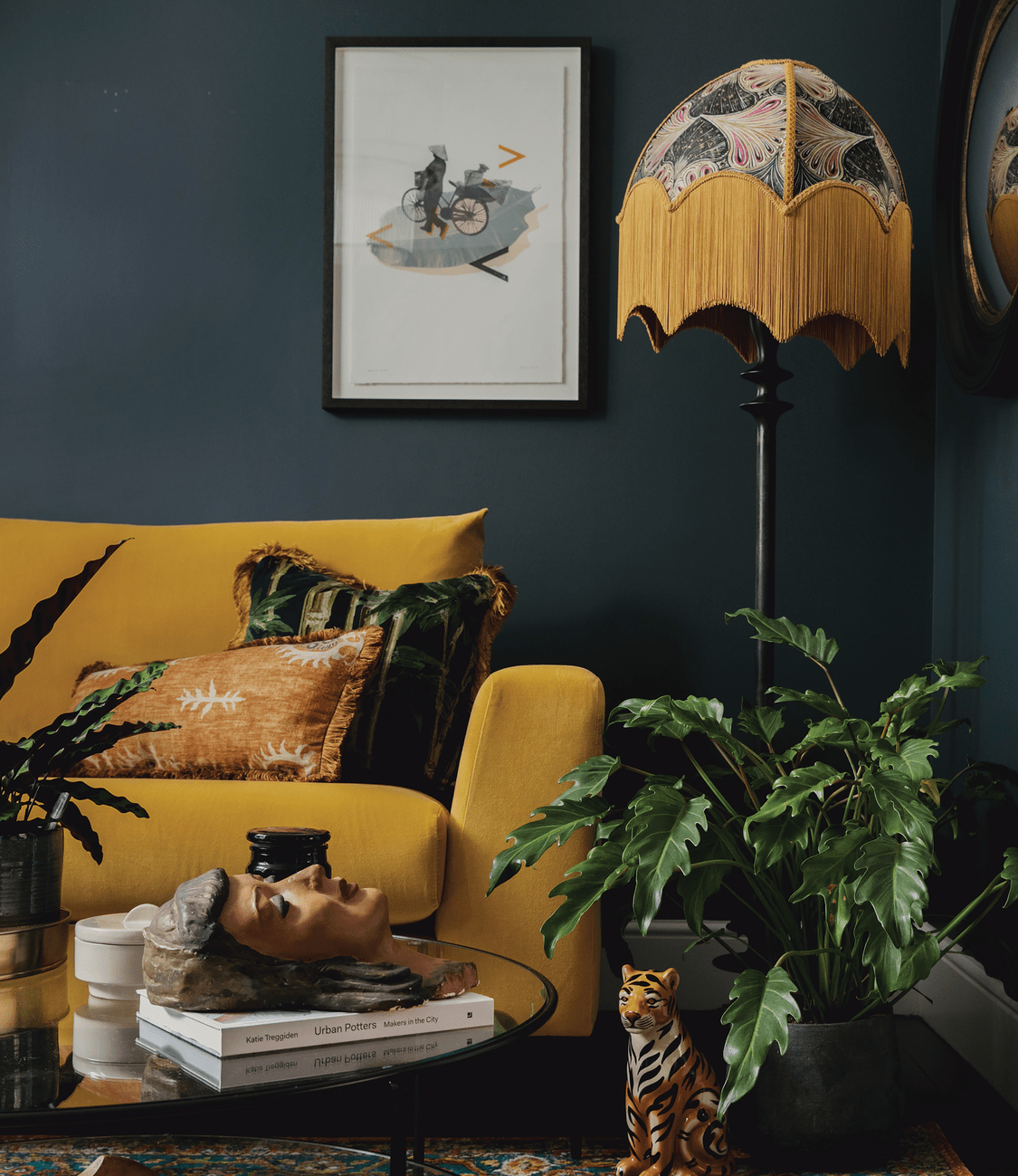
While bold colors are often relegated to furniture or accent walls, Burles and her team enjoy pushing the envelope when clients are willing. Against the stormy teal of the walls, the vibrant mustard-yellow of the sofa and vintage lamp fringe pop in an inviting way. A Vietnamese-inspired art piece, designed in-house, ties the entire palette of the room together. Keeping the artwork fresh and light helps balance the darker tones found throughout the home. Brass accents and vintage curios complete the bold aesthetic.
“Sometimes [the graphics team] will design art or fabrics in our case studies and sometimes they design a sort of neon sign,” explains Burles. “It’s great to have a graphics team that we can go to if we need some art or we can’t find anything, or it doesn’t fit the paint palette or it’s just not quite edgy enough, you know. It just makes it more unique as a layered design.”
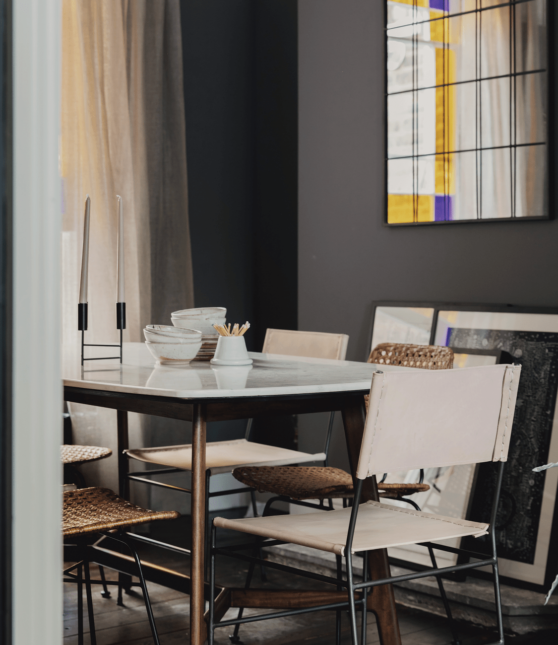
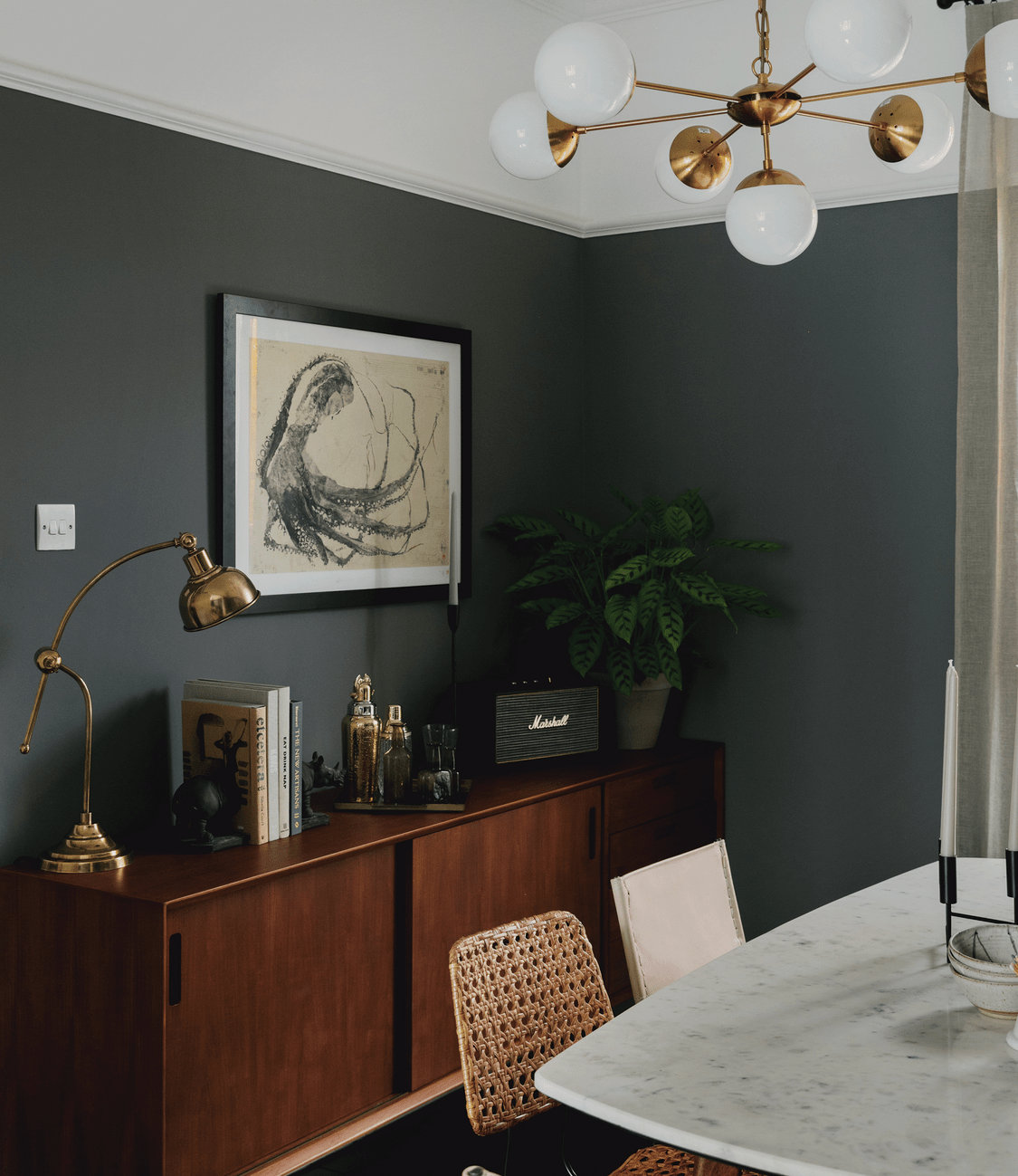
The eclectic charm of the living room gives way to more masculine accents in the adjoining dining room. Paint & Paper Library’s Sharkskin coats the walls in an inky gray, complemented by statement art like the fossilized squid piece by Benjamin Parker. Leather and rattan chairs introduce texture without detracting from the rich, more neutral palette. The home’s natural lighting—darker in the dining room and brighter in the living room—allowed Burles and her team to play with bold colors in a balanced way.
Working with couples on a residential project and incorporating each individual’s preferences can be tricky. Whenever possible, the designer steers her clients away from solely relying on compromise. “Some of the rooms have just got to make your heart sing, right? So let’s divide. Let’s decide what’s your domain, your corner, your nook.” And while these homeowners’ preferences can be identified in the differences between the living and dining rooms, they collaborated on one of the home’s most used spaces: the garden room.
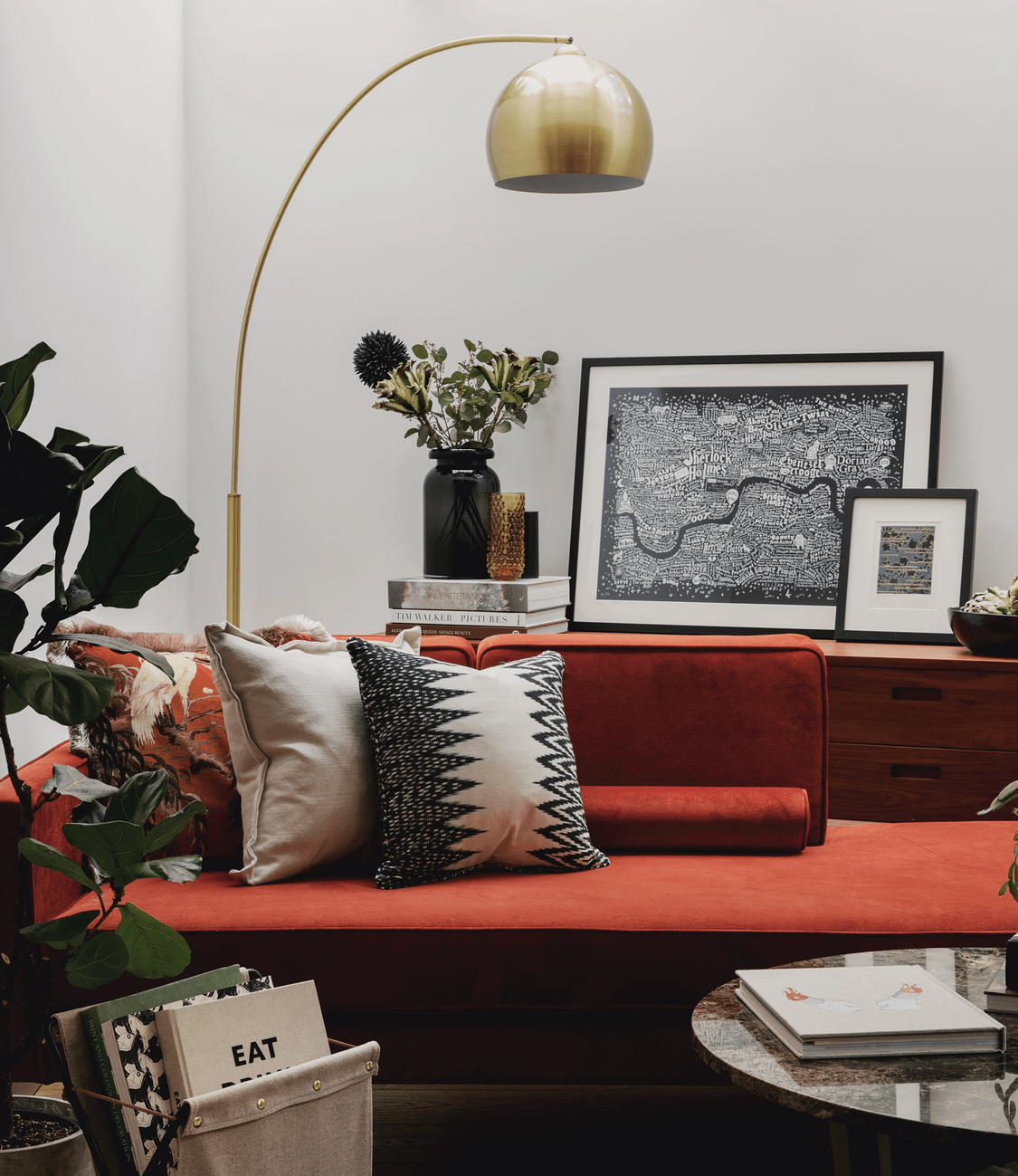
Originally an extra bedroom, the space is now a beautiful reading/working room that overlooks the garden. The greenery and earth-tones of the rust chaise longue and layered pillows bring as much as of the outside in as possible. Like much of the house, vintage finds—“real storytelling pieces,” as Burles calls them—bring a dash of added soul and character to the space.
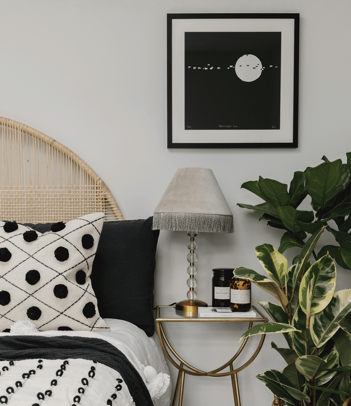
As you move upward through the room, the design palette gradually becomes lighter. Burles notes that the Victorian architecture of the home limits any available sunlight—something that is already sparse in London. “In the bedrooms, sometimes it’s nice to maximize the sense of light that you’ve got. Whereas downstairs, a lot of the year it’s quite dark, so you can embrace the richness and just make it really cozy.”
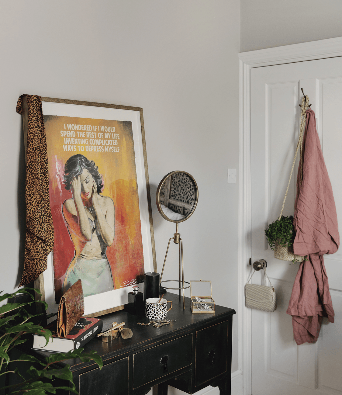
A piece from Trotman, who creates art under the name Dex, complements the monochrome palette of the bedrooms. Vintage pieces like the shutters turned headboard in the primary bedroom and dressing table in the guest room soften the spaces, while dashes of color from pieces in the homeowner’s existing collection offer visual contrast.
Burles kept the previously renovated kitchen and bathroom primarily the same, adding a few small touches like a butcher-block island, vintage cupboard, and fresh touches of paint to “add a bit of heart and soul.” Instead of new flooring, the designer and her team revived the existing wood with a deep, chocolate-colored stain. The handrails and spindles of the original staircase were also retained but given a slight face-lift. Whenever possible, Burles simply helped the home’s existing characterful pieces tell a new story. And for this London home and its owners, the tale is a delightfully bold one.
“[Interior design] is just a wonderful mix of creativity and it’s very intimate—I mean, you’re in their world, their home, their workspace. If you do a great job, it not only looks great but also works well for their life. . . . We’re bringing other people’s visions to life, making it enjoyable, and just pushing them beyond their comfort zone.”